Warm colors—such as rich terracottas, deep ambers, and soft creams—transform houses into inviting, luxurious homes by evoking feelings of comfort and sophistication. When applied to bespoke cabinetry, wooden wall panels, and whole-house customization systems, these hues optimize space perception and elevate the overall aesthetic. MRETTY leverages these warm tones alongside FSC-certified, non-toxic materials to create smart, sustainable, and tailored living environments.
Every magnificent home begins as a whisper of an idea. It starts with a vision of tailored elegance, a desire for spaces that reflect personal style while offering supreme functionality. Translating these ethereal concepts into tangible reality requires a deep understanding of aesthetics, spatial dynamics, and, perhaps most importantly, color theory. Color is the silent language of interior design, dictating the mood, perceived size, and ultimate comfort of every room.
Among the vast spectrum of available hues, warm colors hold a special place in the realm of luxury interiors. They possess an inherent ability to make expansive spaces feel intimate and compact spaces feel rich with character. For individuals embarking on a whole-house customization journey, mastering the use of warm tones is a fundamental step toward achieving a truly bespoke sanctuary.
Whether you are designing a sleek HDB apartment or a sprawling private residence, the strategic application of these inviting shades can completely redefine your living experience. This comprehensive guide explores the profound impact of warm colors in interior design. We will delve into the psychological benefits, modern applications, and sustainable material choices that bring these palettes to life, showcasing how expertly crafted custom cabinetry from MRETTY can turn your vision into a breathtaking reality.
How do warm colors influence the psychology of a room?
Warm colors fundamentally alter the emotional resonance of an interior space. By incorporating shades of red, orange, yellow, and rich earth tones, designers can stimulate feelings of warmth, energy, and secure comfort. These colors draw the eye and advance visually, making large rooms feel more intimate and enveloping.
According to color psychology, warm tones stimulate conversation and appetite, making them particularly effective in social spaces like kitchens and dining areas. For example, an island cabinet finished in a rich, warm walnut tone not only anchors the kitchen visually but also creates a welcoming gathering point for family and guests. The psychological warmth translates directly into a sense of physical comfort.
Furthermore, these hues provide a sense of grounding. In modern, fast-paced lifestyles, coming home to a space enveloped in soft, warm neutrals or deep, earthy reds offers immediate stress relief. When applied to study bookcases or master bedroom wardrobes, these colors foster a serene, focused environment, proving that luxury is as much about how a space feels as how it looks.
What are the best ways to incorporate warm colors into modern interiors?
Integrating warm colors into modern, minimalist designs requires balance and strategic placement. The goal is to infuse warmth without overwhelming the clean lines and space-saving elegance that define contemporary living.
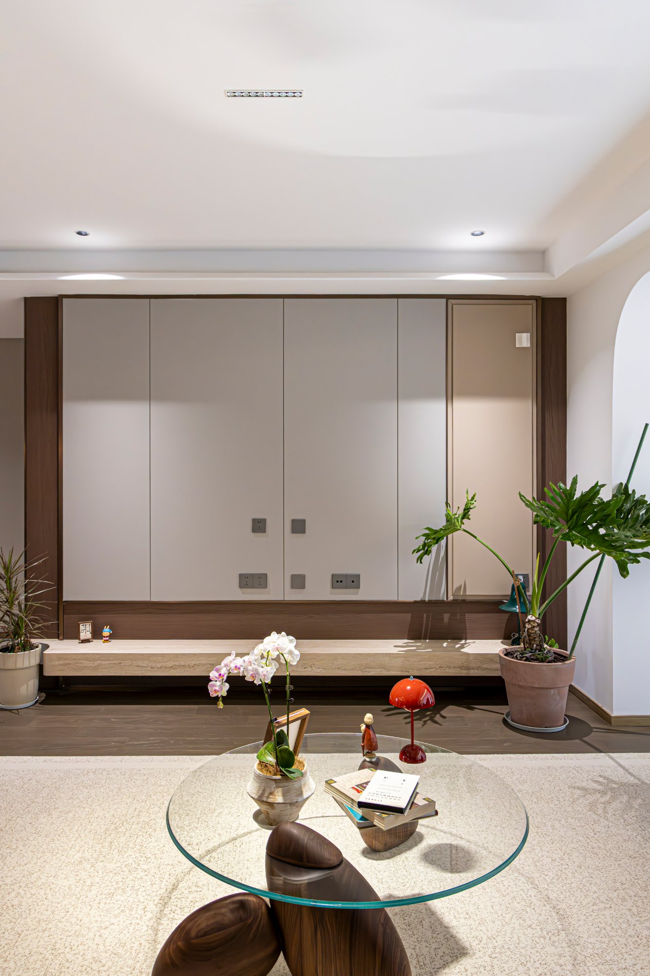
One of the most effective methods is through the use of bespoke cabinetry and architectural features. A beautifully crafted wooden wall panel in a warm honey oak can serve as a stunning focal point in a living room, adding texture and depth without adding clutter. Similarly, entrance shoe cabinets designed with warm wood veneers instantly welcome you home with a sophisticated embrace.
Consider the application of warm colors in functional storage systems. Custom wardrobes featuring matte terracotta or warm beige finishes soften the imposing nature of floor-to-ceiling storage. By choosing bespoke kitchen and cabinet systems that utilize these elegant tones, homeowners achieve a seamless blend of modern simplicity and inviting luxury. The key is allowing the high-quality, eco-conscious materials to speak for themselves, using color to enhance their natural beauty.
Why are warm colors ideal for sustainable material choices?
Warm color palettes naturally complement sustainable and eco-friendly design materials. Earth tones, soft greens, and warm woody browns echo the natural world, creating a harmonious indoor environment that celebrates environmental consciousness.
At MRETTY, the commitment to eco-friendly luxury is paramount. Utilizing certified non-toxic materials, the integration of warm colors is often achieved through natural veneers and sustainable finishes. These materials not only ensure a safe, healthy home environment but also age beautifully, deepening in character and warmth over time.
Choosing sustainable materials for your dining sideboards or bathroom cabinets means investing in longevity. When these pieces feature warm, timeless colors, they transcend fleeting design trends. This approach reduces the need for frequent renovations, aligning perfectly with a sustainable, environmentally responsible lifestyle. It is a choice that benefits both the homeowner's well-being and the planet.
How do natural light and warm tones interact in custom spaces?
While we focus strictly on the physical elements of whole-house customization rather than lighting fixtures, the interaction between natural sunlight and warm cabinetry finishes is a critical design consideration. Natural light has a profound ability to activate warm colors, bringing out their richness and depth throughout the day.
During the morning, bright sunlight can make a soft beige cloakroom feel fresh and expansive. As the day progresses into late afternoon, the golden hour sunlight catches the rich undertones of a cherry-wood study bookcase, creating a dramatic and luxurious atmosphere. Designers must consider the orientation of the room when selecting warm finishes for indoor cabinets.
For north-facing rooms that receive cooler, bluer light, integrating stronger warm tones like amber or rust in the cabinetry can counteract the chill, making the space feel balanced and inviting. Conversely, south-facing rooms that receive plenty of warm sunlight can benefit from softer, muted warm neutrals, ensuring the space remains elegant rather than overpowering.
What do real-world case studies reveal about transformative warm color palettes?
Case studies provide concrete evidence of how warm colors successfully transform challenging floor plans into cohesive, luxurious homes. Examining these real-world examples illuminates the methodologies behind successful space optimization and tailored elegance.
Consider a recent MRETTY project involving a compact urban apartment. The client desired a space that felt open yet deeply comforting. The solution involved a monochromatic warm palette centered around a bespoke island cabinet and matching kitchen systems in a soft taupe finish. This continuous use of a warm, light-reflecting color maximized the perceived space.
In another exploratory case study, a sprawling private residence utilized deep, warm walnut finishes for extensive study bookcases and living room wall panels. This rich color grounded the large, airy rooms, providing a sense of intimate luxury. These case studies prove that whether you are optimizing a small space or organizing a large one, tailored warm cabinetry offers unmatched aesthetic and functional benefits.
What are practical tips for choosing the right warm shades for your home?
Selecting the perfect warm colors for your bespoke cabinetry requires a thoughtful approach tailored to your specific lifestyle and space. Follow these practical steps to ensure a flawless integration:
First, consider the function of the room. High-energy spaces like kitchens benefit from robust, welcoming tones like warm woods or subtle terracottas applied to island cabinets and sideboards. Restful spaces, such as bedrooms, are better suited to soft, warm neutrals like cream or pale blush for custom wardrobes.
Second, evaluate your existing materials and furnishings. If you have cool-toned architectural elements, introducing warm wooden wall panels or bathroom cabinets can provide a striking, sophisticated contrast. Always request physical material samples of the eco-friendly finishes to see how they interact with your home's natural light.
Finally, prioritize seamless smart integration. Modern luxury means your warm, inviting cabinetry can also house the latest smart home technology. Ensure that your design choices accommodate hidden wiring and seamless interfaces, maintaining the elegant, uncluttered look of your custom space.
Frequently Asked Questions
How do warm colors affect the perception of space in small apartments?
Warm, light-to-medium colors like soft beige or warm oak can make small apartments feel expansive and cohesive, especially when applied uniformly across bespoke cabinetry and wall panels. This creates a seamless visual flow that optimizes the perception of space.
Are the warm-toned materials used by MRETTY safe for health-conscious families?
Yes. MRETTY uses only certified non-toxic materials for all custom wardrobes, kitchen systems, and indoor cabinets, ensuring a safe, healthy, and luxurious home environment for all age groups.
Can smart home technology be integrated into warm-toned bespoke cabinetry?
Absolutely. MRETTY's designs seamlessly integrate smart technology—such as hidden automated storage mechanisms and remote-controlled access—into our elegant, warm-toned cabinet systems without compromising the modern, clean aesthetic.
How do I ensure my warm color palette remains timeless?
To achieve a timeless look, focus on warm neutrals and natural wood tones for large investment pieces like island cabinets and study bookcases. These colors defy fleeting trends and offer a lasting sense of sophisticated luxury.
Transforming Inspiration into Reality
The journey to your dream home is paved with inspiration, meticulous planning, and the right partnership. By embracing the power of warm colors, you empower yourself with the vision to create a space that is not only visually stunning but also emotionally resonant. You discover the profound difference that tailored elegance and thoughtful space optimization can make in your daily life.
MRETTY is dedicated to bringing your unique vision to life with uncompromising quality and sustainable practices. We proudly utilize FSC-certified materials, ensuring that your luxurious new spaces are as kind to the environment as they are beautiful to behold. Our commitment to utilizing non-toxic, eco-friendly materials guarantees that your home is a true sanctuary of health and high design. Let us turn your inspiration into a breathtaking reality.
Book a Free Consultation Now.
Aida
Lead Interior Architect, MRETTY
Winner of the Global Excellence in Design Award for "The Azure Haven" bespoke residential project.
MRETTY: Premium Bespoke Kitchen & Cabinet Systems Provider in Singapore.