
 Singapore
 China
China
A world awash in color is a world alive with feeling. From the gentle blush of dawn to the deep indigo of twilight, nature’s most captivating moments are often painted in gradients. In the realm of design, mastering color gradient design techniques is not merely a technical skill; it is the art of breathing life, emotion, and sophistication into a visual narrative.
A well-executed gradient can guide the eye, evoke a mood, and transform a simple layout into a luxurious, immersive experience. It’s the subtle transition from one hue to another that creates depth, dimension, and a sense of refined elegance, moving beyond the limitations of solid colors.
For those with a discerning eye for aesthetics, gradients offer a palette of infinite possibilities, introducing a dynamic flow that feels both organic and intentional. At MRETTY, we believe that exceptional design lies in the details, just as we meticulously craft bespoke kitchen and cabinet systems. We understand that the thoughtful application of color is fundamental to creating spaces and visuals that resonate, and this guide will empower you to infuse your projects with a new level of artistry.
Understanding the Essence of Color Gradients
At its core, a color gradient, or color ramp, is a gradual blending of two or more colors. This transition can occur across an area, along a line, or from a central point outward, creating a soft, seamless progression that feels natural and fluid. Their importance in modern design cannot be overstated, as gradients add visual interest, establish a hierarchy of information, and can even influence user perception and emotion.
The resurgence of gradients in web and graphic design signals a move towards more human-centric and emotionally resonant aesthetics. They can make a flat interface feel three-dimensional, lend a touch of warmth to a minimalist composition, and create a memorable brand identity. A sublime gradient feels less like a design choice and more like an experience—a gentle journey from one state of being to another. This is the power MRETTY harnesses: creating transitions that are as smooth and flawless as our custom-built cabinetry.
Types of Color Gradients: A Palette of Possibilities
To master the art of gradients, one must first understand the different forms they can take. Each type offers a unique way to blend color and achieve distinct visual effects, providing a versatile toolkit for designers.
Linear Gradients
The most common and straightforward type, a linear gradient progresses from one color to another along a straight line. You can define the direction of this line—horizontally, vertically, or diagonally—to control the flow of color. A horizontal gradient can evoke a sense of calm and stability, reminiscent of a horizon, while a vertical gradient might suggest growth or movement. The angle of a linear gradient is a powerful tool for directing the user's gaze and creating a dynamic composition.
Radial Gradients
A radial gradient emanates from a single point, with colors blending outwards in concentric circles or ellipses. This creates a natural focal point, drawing attention to the center of the effect. Radial gradients are perfect for highlighting a specific element, like a button or a logo, or for creating a subtle vignetting effect that adds depth and focus. The shape can be circular or elliptical, and the center point can be positioned anywhere to create varied and dramatic lighting effects.
Conic (Angular) Gradients
Less common but wonderfully dramatic, a conic or angular gradient transitions in a circular pattern around a central point, much like the hands of a clock. Instead of radiating from the center, the colors sweep around it. This creates a vibrant, wheel-like effect that is perfect for pie charts, color pickers, or creating abstract, energetic backgrounds. Conic gradients are a testament to how creative color blending can be, offering a unique spin on circular color transitions.
Diamond Gradients
A variation of the radial gradient, the diamond gradient transitions colors outward from a central point in a diamond or square shape. This geometric approach offers a more structured and modern feel compared to the soft, organic look of a circular radial gradient. It’s an excellent choice for creating bold, graphic patterns and backgrounds that feel both sophisticated and contemporary.
Mesh Gradients
For the true artist, the mesh gradient offers the ultimate control. It involves creating a grid, or mesh, over an object and assigning different colors to various points on the grid. The software then smoothly blends these colors together, creating a complex, multi-toned, and often photorealistic effect. Mesh gradients allow for incredibly subtle and nuanced color transitions, perfect for creating organic shapes, delicate lighting, and visuals that possess an almost tangible depth. This technique is a hallmark of high-end design, reflecting a commitment to detail that we at MRETTY deeply appreciate.
Best Practices for Elegant Gradient Application
Using gradients effectively is a delicate balance. A poorly chosen gradient can look dated or distracting, while a thoughtfully crafted one elevates the entire design. Consider these best practices for optimal results:
Choose Colors with Purpose: The colors you select will define the mood. A gradient of soft pastels can feel calming and serene, while a blend of bold, contrasting colors can be energetic and vibrant. Use color theory to your advantage; analogous colors (next to each other on the color wheel) create harmonious, subtle blends, while complementary colors (opposite each other) produce dramatic, high-contrast results.
Subtlety is Key: Often, the most effective gradients are the ones you barely notice. A very subtle gradient used as a background can add depth and texture without overwhelming the content. Avoid harsh transitions between extremely different colors unless you are aiming for a deliberately jarring effect.
Mind the Direction: With linear gradients, the angle of the transition matters. It can guide the user's eye towards a call to action or create a sense of movement. Experiment with different angles to see what best complements your layout.
Ensure Readability: When using a gradient behind text, always prioritize legibility. The contrast between the text and all parts of the gradient background must be sufficient. If your gradient transitions from a light to a dark color, ensure your text color works well against both extremes.
Stay on Brand: Your gradients should align with your brand’s visual identity. The colors, intensity, and style should feel like a natural extension of your brand palette, reinforcing its personality, whether it be playful, corporate, or luxurious. At MRETTY, our aesthetic is one of modern elegance, and our use of color always reflects this refined sensibility.
Tools and Software for Crafting Perfect Gradients
Creating beautiful gradients has never been more accessible, thanks to a host of powerful design tools and software. These platforms offer varying degrees of control and ease of use, catering to different design needs:
Adobe Photoshop & Illustrator: These industry standards offer unparalleled control. Photoshop's Gradient Tool and Gradient Map feature are incredibly powerful for both simple and complex blends. Illustrator's Freeform Gradient tool, which allows for the creation of sophisticated mesh gradients, is a game-changer for vector-based designs.
Figma & Sketch: These UI/UX-focused platforms have made gradient creation intuitive and seamless. Their simple interfaces allow designers to quickly create and modify linear, radial, and angular gradients directly within their design frames, making them perfect for web and app design.
CSS Gradient Generators: For web designers, numerous online tools like CSS Gradient and ColorZilla can generate the necessary CSS code for gradients. These tools provide a visual interface to build your gradient and then output clean, cross-browser compatible code, saving valuable development time.
Inspiring Examples of Gradients in Modern Design
Gradients are everywhere, subtly shaping our digital experiences and adding a layer of sophistication. Think of the iconic Instagram logo, a simple camera icon brought to life by a vibrant sunrise gradient. Or consider Asana's branding, which uses soft, ethereal gradients to create a sense of calm and clarity in its interface.
In user interfaces, a subtle linear gradient on a button can make it appear more clickable and three-dimensional, enhancing user interaction. On websites, large-scale background gradients can set an immersive mood, transforming a simple landing page into a captivating visual statement. These examples show that whether bold or understated, gradients are a powerful tool for creating modern, engaging, and emotionally resonant designs.
Combining Gradients with Other Design Elements
Gradients rarely exist in isolation; their true power is unlocked when they are harmoniously combined with other elements. This synergy creates richer, more dynamic visual compositions.
Gradients and Typography: Applying a gradient directly to large, bold typography can create a stunning focal point. Alternatively, using a subtle gradient as a background can make clean, minimalist text pop, enhancing its visual impact.
Gradients and Textures: Overlaying a subtle noise or grain texture on top of a gradient can add a tactile quality and a touch of vintage appeal. This technique also helps to reduce color banding, an issue where the steps in a gradient become visible.
Gradients and Shapes: Using gradients to fill geometric shapes or abstract blobs can create dynamic, visually interesting compositions. This interplay of color and form is a cornerstone of contemporary graphic design.
MRETTY: Where Design and Quality Converge
At MRETTY, we see every kitchen and cabinet system as a canvas for impeccable design. Our philosophy extends beyond mere function; we aim to create spaces that inspire and delight. Our commitment to using FSC-certified, eco-friendly materials ensures that your home is not only beautiful but also sustainable and healthy.
We integrate smart technology seamlessly, offering solutions that are as intelligent as they are elegant. This holistic approach, from material selection to the final aesthetic touches, mirrors the art of creating the perfect gradient—a harmonious blend of elements resulting in something truly exceptional. The principles of good gradient design—balance, harmony, and purposeful color—are the same principles we apply to our bespoke creations.
Each element is carefully considered to contribute to a cohesive and luxurious whole. We believe that your home should be a reflection of your taste, a sanctuary of modern elegance. Elevate your space with a design that understands the art of transition. Discover the MRETTY difference.
Book a Free Consultation Now
Related Products
Whole-house Customization: Ingenious conception in mind, good life in the kitchen. Our holistic approach ensures every room flows with seamless elegance.
Bespoke Kitchen Systems: The heart of your home, crafted with precision and passion. Discover materials and finishes that speak your language.
Custom Wardrobes & Cabinets: Where the line is always simple, and the structure is always unexpected. Maximize your space with intelligent, stylish storage.
Customer FAQs
Q: Can your designs fit my unique space?
A: Absolutely. Our designs are fully customizable. We measure and craft each piece to fit your exact specifications, ensuring a perfect integration into your home.
Q: What kind of materials do you use?
A: We are committed to quality and sustainability. We use premium, FSC-certified eco-materials that are durable, beautiful, and safe for your family.
Q: Is the smart technology difficult to use?
A: Not at all. We design our smart home integrations to be intuitive and user-friendly. Our team provides a comprehensive walkthrough to ensure you feel confident and in control.
Client Showcase
The Sentosa Cove Residence: A stunning minimalist kitchen featuring a seamless island with integrated smart appliances. The subtle gradient of the lacquered cabinetry from soft grey to charcoal creates an atmosphere of serene sophistication.
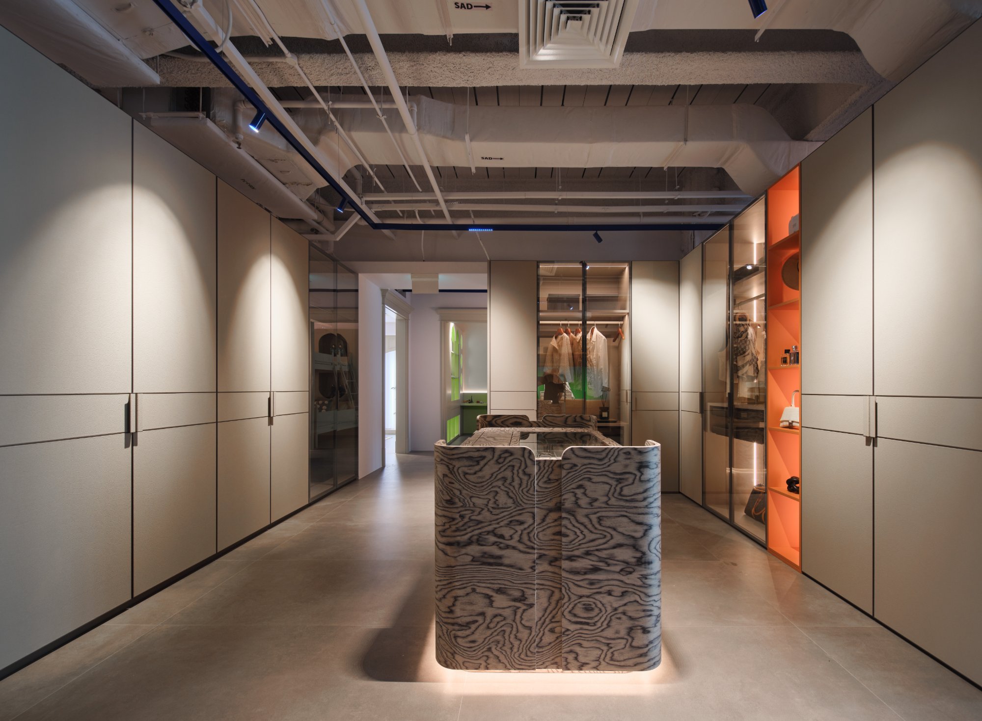
- The Orchard Road Penthouse: Our team designed a full-house solution, including a walk-in wardrobe with automated lighting and custom storage. The design won praise for its efficient use of space and luxurious feel.
Yang Song
Senior Designer, MRETTY
With over a decade of experience in high-end interior design, Yang Song is renowned for his minimalist aesthetic and masterful use of color. His work on "The Azure Villa" project won the prestigious Singapore Interior Design Award for "Best Residential Kitchen Design" in 2023.
MRETTY: Premium Bespoke Kitchen & Cabinet Systems Provider in Singapore.
