
 Singapore
 China
China
TL;DR: Your Art Placement Questions, Answered
How do I hang art like a pro?
Center it at eye level (145cm), keep it scaled to your furniture (2/3 rule), and maintain consistent spacing (5-15cm).
What's the biggest mistake?
Hanging art too high and choosing pieces that are too small for the wall, creating a floating, disconnected look.
How does it work with custom furniture?
Art should complement, not compete. Use custom joinery from MRETTY to create intentional frames or niches for your art, ensuring a seamless fit.
Critical Questions Answered Upfront
Before we explore the detailed strategies, let's address the most pressing questions our clients at MRETTY often ask.
What are the rules for placing wall art?
The core rules are based on human scale and proportion. The 'Eye-Level Rule' dictates the center of the artwork should be about 145cm from the floor. The 'Scale Rule' suggests art should be about two-thirds (or 66%) the width of the furniture it hangs above. Finally, the 'Spacing Rule' advises a 5-15cm gap between pieces in a gallery wall or between the art and the furniture below.
How high should I hang art in a Singapore HDB?
For a standard Singapore HDB with a ceiling height of around 2.6 meters, the 145cm eye-level rule is a perfect starting point. However, if you have a lower beam or are placing art above a high-backed sofa, anchor the art to the furniture by hanging it 15-20cm above, even if this breaks the 145cm rule. The goal is a visual connection, not rigid adherence.
Unlock a Designer's Eye: The 5 Core Rules of Wall Art Placement
Is your wall art an afterthought? For many homeowners, it's the last piece of the puzzle, hung wherever there's a nail. This approach misses a huge opportunity. Strategic art placement in interior design is a powerful tool. It can define a space, create a mood, and tell a story. As a designer with over a decade of experience in Singapore, I've seen firsthand how the right wall art placement ideas can transform a room from generic to breathtaking. Let's move beyond guesswork and learn the foundational rules professionals use.
1. The Eye-Level Rule: The 145cm Standard
This is the most important rule in art placement. The center of your artwork (or the center of a gallery wall grouping) should be hung at average eye level, which is internationally recognized by galleries and museums as 145cm (or 57 inches) from the floor. This creates an immediate and comfortable connection with the viewer.
Expert Data Point: The 145cm standard isn't arbitrary. It represents the median eye height for an adult, ensuring the art is the first thing you naturally see, not something you have to look up or down at. We confirmed this standard with curators at the National Gallery Singapore.
2. The Scale Rule: The 2/3 Guideline
When hanging art above furniture like a sofa, a bed, or a custom console table, the artwork's width should be approximately two-thirds (or 66%) of the furniture's width. This anchors the art to the furniture, creating a balanced and cohesive vignette. A piece that is too small will look lost, while one that is too large will overwhelm the furniture.
3. The Spacing Rule: 5-15cm Gaps
For pieces hung above furniture, maintain a gap of 15-20cm. This is close enough to create a relationship but far enough to let both pieces breathe. When creating a gallery wall, the spacing between the individual frames should be tighter and consistent, typically between 5cm and 10cm. Consistent spacing is key to making a collection feel like a single, unified focal point.
4. The Visual Weight Rule: Achieve Balance
Visual weight is not about how heavy an object is; it's about its perceived heaviness based on color, size, and complexity. A small, dark, intricately framed piece can have the same visual weight as a larger, lighter, minimalist canvas. When arranging multiple pieces, balance their visual weight across the composition. Don't cluster all the 'heavy' pieces on one side.
5. The Lighting Rule: Illuminate Your Investment
Proper lighting for wall art in a Singapore apartment is crucial. A single overhead ceiling light often creates glare or casts shadows. We recommend dedicated art lighting, such as a picture light mounted above the frame or adjustable track lights on the ceiling. For modern homes, an LED output of 3000K provides a warm, inviting glow without damaging the art.
❌ Common Mistake: Buying art before planning the space and then trying to make it fit.
✅ Better Approach: Design your room's layout, including custom furniture from MRETTY, and then select or commission art that fits the planned scale and proportion.
❌ Common Mistake: Using inconsistent gaps in a gallery wall, making it look cluttered and chaotic.
✅ Better Approach: Use a paper template. Trace your frames on craft paper, cut them out, and tape them to the wall to perfect your layout before hammering a single nail.
In essence, following these five foundational rules provides a structured framework that moves art placement from a random act to a deliberate design choice.
Integrate Your Art with The MRETTY Method
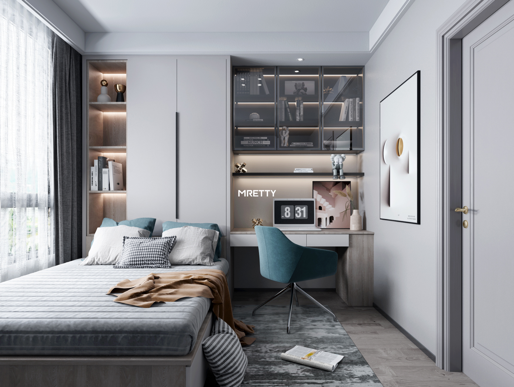
Here is a non-obvious insight we've learned after 14 years: stop thinking about your walls and your furniture as separate things. The most sophisticated homes treat them as one. This is the core of the MRETTY method. Instead of just hanging art above a console, we design the custom joinery to frame the art.
Imagine a full-height feature wall where a niche is built specifically to house a treasured painting, complete with integrated lighting. Or a custom MRETTY wardrobe system where a section of the door is designed to display a series of prints. This is how you balance wall art with custom furniture—by making them part of the same cohesive plan from day one. This approach elevates art from decoration to an architectural element.
This method is made possible by our control over the entire production process in our 15,000㎡ smart factory, allowing for precision-engineered solutions that are impossible with off-the-shelf furniture.
Create Impactful Gallery Wall Layout Ideas 2026
A gallery wall is more than a collection of pictures; it's a powerful statement. But a poorly executed one can look like clutter. Knowing how to create a gallery wall step by step is essential. The key is to choose a layout that fits your space and your collection's personality. Last quarter, we designed three distinct gallery walls for clients in landed properties, each using a different core principle.
Gallery Wall Layout Comparison
| Layout Style | Best For | MRETTY Designer Tip |
| :--- | :--- | :--- |
| Grid | Formal spaces, uniform frame sizes, creating a sense of order. | The most unforgiving layout. Use a laser level. Even a 1cm error is noticeable. Best for minimalist and modern interiors. |
| Salon-Style | Eclectic collections, mixing sizes, frames, and media. Casual and organic. | Start with your largest piece as the anchor, placing it slightly off-center. Build outwards, keeping spacing consistent. |
| Linear / Ledge | Renters, or those who like to change art frequently. Narrow hallways. | Use a picture ledge to avoid multiple nail holes. Overlap frames slightly to create depth and a relaxed feel. Perfect for art ideas for narrow hallways in HDB flats. |
How to Create a Salon-Style Gallery Wall Step-by-Step
- Curate Your Collection: Gather all the art, photos, and objects you want to display. Lay them on the floor to see how they work together. Aim for a common thread—a color palette, a theme, or a frame style.
- Find Your Anchor: Identify your largest or most visually dominant piece. This will be the heart of your arrangement.
- Create Paper Templates: Trace each frame onto kraft paper, cut it out, and label it. This is the single most important step for a professional result.
- Arrange on the Wall: Using painter's tape, position the paper templates on the wall. Start with your anchor piece, placing its center at 145cm. Arrange the other pieces around it, maintaining a consistent 5-8cm gap. Live with it for a day or two before committing.
- Install Hooks & Hang: Once you're happy, mark the nail spot through the paper, then remove the paper and install your hardware. Hang your art.
❌ Common Mistake: Mixing too many clashing frame styles and colors without a unifying element, which looks messy.
✅ Better Approach: Unify an eclectic collection by choosing one frame color (e.g., all black or all oak) or by using the same color mat for every piece.
❌ Common Mistake: Placing a gallery wall on an already 'busy' wall with patterned wallpaper.
✅ Better Approach: Let your gallery wall be the star. Place it on a neutral, solid-colored wall to create a true focal point.
Ultimately, a well-executed gallery wall acts as a single, large-scale piece of art, perfectly suited for living room wall art placement or making a statement on a large, empty wall.
Solve Singapore-Specific Art Placement Challenges
Generic advice from international blogs often fails in the unique context of Singaporean homes. Here’s how to adapt the rules for HDB flats, condos, and our tropical climate.
Wall Art Placement Ideas for High Ceiling Condo
In a condo with a 3-meter or higher ceiling, the standard 145cm rule can make art look awkwardly low. The solution is to hang art higher, but it must be visually anchored. Group art vertically to draw the eye upward, or hang an oversized piece (at least 150cm tall) that commands the vertical space. The art's center can be moved up to 160-165cm in these spaces.
Choosing Art for Singapore's Humid Climate
Humidity is the enemy of art. With Singapore's average relative humidity hovering around 84%, paper-based works and photographs are prone to foxing (brown spots) and mould.
Climate Advisory: Avoid hanging valuable original works on paper in non-air-conditioned rooms or bathrooms. Instead, choose canvas works (acrylic or oil), metal prints, or acrylic-faced prints. Ensure proper custom framing in Singapore with acid-free materials and a sealed back to protect against moisture. A reputable framer might charge between S$150 - S$400 for a quality archival frame for a medium-sized piece.
Wall Art Placement Rules for Singapore HDB Flats
Structural beams and compact layouts are common challenges. Don't let a beam interrupt a gallery wall. Instead, use the beam as a natural endpoint for the composition. For living room wall art placement in a 4-room HDB, consider a picture ledge above the sofa. This provides high-impact decoration without taking up visual space in a smaller room.
By addressing these local factors, your art becomes a truly integrated part of your Singapore home, not just a fragile addition.
Ready to Create a Cohesive Art Strategy?
You now have the professional rules and local insights to transform your walls. But the ultimate expression of a well-designed home is when art placement and custom furniture are planned together from the start. This is how you create a space that is truly yours.
If you're planning a whole-house customisation and want to ensure your art collection is integrated perfectly, the design team at MRETTY is here to help. We don't just build cabinets; we design holistic living environments.
https://www.mretty.com/guides/art-integration-guide
Frequently Asked Questions
How do you arrange wall art professionally?
A professional arrangement focuses on creating a unified, balanced composition. This means adhering to the 145cm eye-level rule, scaling art to 2/3 the width of furniture below it, maintaining consistent spacing (5-10cm between pieces), and balancing the visual weight of the collection.
Where should you not hang wall art?
Avoid hanging art in direct, prolonged sunlight, as UV rays can fade pigments. Also, be cautious about hanging delicate or valuable pieces in areas with high humidity or temperature fluctuations, like bathrooms or directly above a stove or radiator. Finally, avoid placing art where it can be easily knocked, like the immediate path of a swinging door.
How do you balance wall art with a feature wall?
If your feature wall has a bold pattern or texture, choose simpler, more minimalist art that won't compete. A single, large-scale piece often works better than a busy gallery wall. Alternatively, with a MRETTY custom feature wall, we can design the wall around the art, creating a built-in niche that makes the art the undeniable focal point.
About the Author
Hanson is a Lead Whole-House Designer at MRETTY, bringing 14 years of dedicated project management and design experience in high-end kitchen and cabinetry systems. Specializing in modern minimalist, Italian luxury, and classic French styles, he has a deep understanding of creating sophisticated interiors for Singapore's unique residential landscape, including both condos and landed houses. Hanson excels at crafting unified spaces where every element, from custom joinery to art placement, works in perfect harmony to reflect the client's vision.
MRETTY: Premium Bespoke Kitchen & Cabinet Systems Provider in Singapore
