The enduring appeal of a masterfully executed neutral color palette remains eternal in the world of design. These understated yet powerful palettes offer a sanctuary of calm, a canvas for personal expression, and a foundation for enduring style. They are the quiet language of sophistication, speaking volumes through nuance and texture. A neutral palette is more than just an absence of bright color; it is a deliberate choice, an art form that balances light, shadow, and tone to create spaces that feel both aspirational and deeply personal. From the soft whisper of alabaster white to the deep resonance of charcoal grey, these hues craft an atmosphere of serene luxury.
At MRETTY, we believe that the most profound statements are often made with the quietest confidence. Our philosophy is rooted in creating bespoke environments that reflect the unique essence of our clients, and neutral palettes provide the perfect starting point for this journey. They are versatile, allowing architectural details and exquisite materials to shine, while providing a backdrop that adapts to the evolving tastes of those who inhabit the space. This guide will explore the boundless possibilities of neutral color palettes, revealing how to harness their subtle power to create interiors of unparalleled elegance and timeless appeal. We will delve into the psychology of these shades, uncover inspired combinations, and demonstrate how MRETTY’s commitment to craftsmanship and quality can bring your vision to life.
The Psychology and Power of Neutrals
Colors are not merely decorative; they are emotional cues that shape our experience of a space. Neutral colors, with their connection to the natural world—stone, earth, clouds, and sand—possess an inherent ability to soothe and ground us. They reduce visual noise, allowing the mind to rest and focus. This psychological comfort is one of the primary reasons for their lasting popularity in interior design.
A thoughtfully chosen neutral scheme can make a small room feel larger and more open, or a vast space feel more intimate and inviting. Lighter neutrals like beige, cream, and soft grey reflect light, creating an airy, expansive feel. Darker neutrals, such as slate, espresso, and navy, absorb light, fostering a sense of warmth, security, and drama. The power of a neutral palette lies in its subtlety and its ability to serve as a sophisticated foundation for other design elements.
It allows the texture of a wooden cabinet, the veining in a marble countertop, or the gleam of a metallic fixture to become a focal point. MRETTY harnesses this power, using high-quality, eco-friendly materials to introduce layers of texture and depth, transforming a simple neutral background into a rich, tactile experience.
Crafting Your Palette: A Spectrum of Neutral Tones
The world of neutrals is far richer and more diverse than just black, white, and grey. It encompasses a vast spectrum of hues, each with its own undertone and personality. Understanding these nuances is key to creating a cohesive and harmonious design.
Warm Neutrals: An Invitation to Comfort
Warm neutrals are imbued with red, orange, or yellow undertones, creating a cozy and welcoming ambiance.
- Beige and Tan: Timeless and versatile, these colors evoke the feeling of sandy beaches and natural linen. They pair beautifully with rich woods and warm metals like brass and bronze.
- Cream and Ivory: Softer than pure white, these shades offer warmth without sacrificing brightness. They create a gentle, luminous quality, ideal for living rooms and bedrooms where comfort is paramount.
- Taupe and Greige: A sophisticated blend of grey and beige, these colors offer the best of both worlds. They are incredibly adaptable, shifting in appearance with the changing light and pairing seamlessly with both warm and cool accents.
Cool Neutrals: A Breath of Sophistication
Cool neutrals have blue, green, or purple undertones, lending a crisp, modern, and serene feel to a space.
- Shades of Grey: From the palest silver to deep charcoal, grey is the epitome of modern elegance. It can be sleek and industrial or soft and calming. MRETTY often utilizes shades of grey in bespoke kitchen systems to create a clean, professional, and highly stylish aesthetic.
- Cool Whites: Whites with a hint of blue or grey provide a stark, clean backdrop that is perfect for minimalist and contemporary designs. They make art and architectural details pop.
- Muted Blues and Greens: While bordering on color, soft, desaturated blues and greens can function as neutrals. They bring a sense of nature and tranquility indoors, reminiscent of sea and sky.
Application in Interior Design: The MRETTY Approach
A neutral color palette is the cornerstone of sophisticated interior design. It provides a versatile canvas that allows for endless creativity and personalization. At MRETTY, we leverage the power of neutrals to craft bespoke whole-house customizations that are as functional as they are beautiful.
The Living Room: A Sanctuary of Serenity
In the living room, a neutral palette creates a calming retreat from the outside world. Imagine walls painted in a soft greige, complemented by a plush cream sofa and dark wood cabinetry. The interplay of light and dark neutrals adds depth, while textures—a woven rug, velvet cushions, a smooth marble coffee table—add interest.
MRETTY’s custom-built media units and shelving, finished in elegant neutral tones, can be integrated seamlessly into this environment, providing stylish storage that enhances the room’s tranquil atmosphere. Our designs prioritize clean lines and uncluttered surfaces, allowing the quality of the materials and the harmony of the color scheme to take center stage.
The Kitchen: The Heart of Modern Elegance
The kitchen is often the hub of the home, and a neutral palette ensures it remains a timeless and inviting space. MRETTY specializes in premium bespoke kitchen systems where neutral tones shine. Consider a kitchen with sleek, handleless cabinets in a matte charcoal grey, paired with a pristine white quartz countertop. The contrast is dramatic yet sophisticated. For a warmer feel, light oak or walnut cabinets combined with creamy white surfaces create an organic, welcoming environment.
Our commitment to excellence is evident in every detail. We use advanced materials and finishes that are not only beautiful but also durable and easy to maintain. A neutral MRETTY kitchen is a testament to functional luxury, a space designed for both everyday living and elegant entertaining. The versatility of the palette means you can easily update the look with colored accessories, small appliances, or a vibrant backsplash, without ever needing a full renovation.
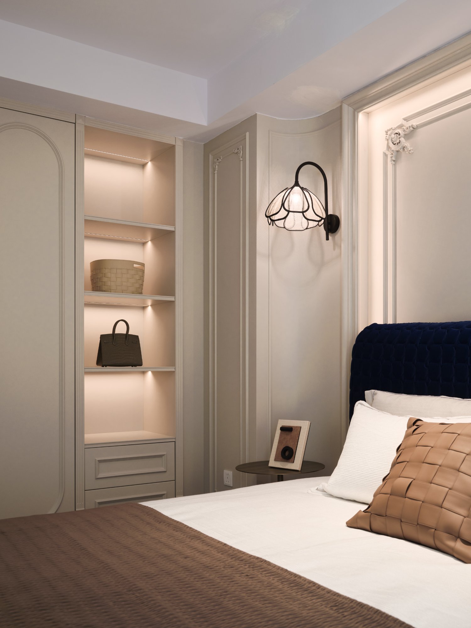
The Bedroom: A Personal Haven
The bedroom should be a sanctuary for rest and rejuvenation. Neutral palettes are perfectly suited for creating this atmosphere. A monochromatic scheme, using varying shades of a single neutral like taupe or soft grey, can be incredibly soothing. Layering different textures is key to preventing a monochromatic room from feeling flat. Think of a linen headboard, a silk throw, a wool carpet, and crisp cotton sheets, all in harmonious neutral tones. MRETTY’s custom wardrobes and storage solutions, designed to match your chosen palette, help maintain a serene, clutter-free environment, further enhancing the room’s peaceful quality.
Beyond the Home: Neutrals in Branding and Fashion
The principles of a neutral color palette extend far beyond interior design. In the world of fashion, luxury brands often rely on neutral colors to convey sophistication and timelessness. A classic beige trench coat, a black dress, or a grey cashmere sweater are style staples that transcend seasons and trends. They form the foundation of a versatile wardrobe, allowing for personal expression through accessories and layering.
Similarly, in branding, neutral palettes are used to communicate trust, reliability, and premium quality. Technology companies, financial institutions, and luxury brands often use black, white, and grey to create a clean, modern, and authoritative identity. A neutral base allows a single accent color to have a greater impact, drawing the eye to a logo or call to action. The MRETTY brand itself embraces this philosophy, using a refined color scheme that reflects our commitment to elegance, quality, and timeless design.
Tips for Mastering Your Neutral Palette
- Focus on Undertones: Pay close attention to the undertones of your chosen neutrals. A beige with a pink undertone may clash with a grey that has a green undertone. Stick to either warm or cool undertones for a harmonious look, or use a true neutral like pure white or black to bridge the gap.
- Layer Textures: Texture is the secret weapon of a neutral design. A mix of rough and smooth, matte and glossy, soft and hard surfaces adds depth and visual interest. Combine wood, metal, stone, linen, wool, and glass.
- Introduce an Accent: A neutral palette provides the perfect backdrop for a pop of color. An accent chair, a piece of artwork, or a collection of cushions in a vibrant hue can bring energy and personality to the space. The beauty of this approach is that you can easily change the accent color to refresh the room's look.
- Harness the Power of Lighting: Lighting dramatically affects how colors are perceived. Natural light will reveal the true character of a neutral hue, while artificial lighting can alter it. Use a mix of ambient, task, and accent lighting to create mood and highlight different areas of your room.
- Don’t Forget Black: A touch of black can ground any neutral palette, adding definition and a touch of sophistication. Use it in small doses—a picture frame, a light fixture, or the leg of a chair—to add a crisp finishing touch.
Explore MRETTY's Related Products
Explore our collections to find the perfect elements for your neutral-themed space:
- Bespoke Kitchen Systems: Discover our range of custom kitchens, available in a sophisticated array of neutral finishes from matte grey to warm oak.
- Whole-House Customization: Let us design a cohesive look for your entire home, with custom wardrobes, media centers, and storage solutions that embody timeless elegance.
- Premium Wardrobes: Organize your life in style with our beautifully crafted wardrobes, designed to integrate seamlessly into your serene bedroom retreat.
Customer FAQs
- Q: Will a neutral room be boring?
A: Not at all! The key to an exciting neutral room is the masterful use of texture, layering, and subtle tonal variations. A well-designed neutral space is sophisticated and serene, not boring. At MRETTY, we use contrasting materials and finishes to create dynamic, engaging interiors.
- Q: Are neutral palettes suitable for families with children?
A: Absolutely. Many modern materials offered by MRETTY, such as high-performance laminates and quartz surfaces, are incredibly durable, stain-resistant, and easy to clean. Choosing darker neutrals or materials with subtle patterns can also be a practical choice for high-traffic family homes.
- Q: How can I choose the right white paint?
A: Consider the room's natural light and the other elements within it. A north-facing room might benefit from a warmer white to counteract the cool light. A south-facing room can handle a cooler, crisper white. We recommend testing samples on your wall and observing them at different times of day.
A Legacy of Quality and Trust
A neutral palette is more than a design choice; it is an investment in a timeless aesthetic. It is a commitment to a style that will endure, providing a backdrop for your life’s evolving story. To create a truly exceptional space, the quality of the materials and the precision of the craftsmanship are paramount.
At MRETTY, we are dedicated to realizing this vision of enduring elegance. Our commitment to sustainability and quality is certified by our use of FSC-certified materials, ensuring that your beautiful home is also a responsible one. We merge inspired design with meticulous execution, creating bespoke furniture that is not just seen, but felt.
Let us help you craft a home that is a testament to your taste and a sanctuary for your soul. Begin the journey toward a space defined by sophisticated simplicity and unparalleled quality.
Book a Free Consultation Now
Authored by: Yang Song, Lead Designer at MRETTY
With a portfolio celebrated for its minimalist elegance, 杨松 was the recipient of the prestigious "Golden Ratio" design award for his work on the "Sentosa Cove Waterside Residence" project, a masterclass in neutral-toned coastal luxury.
MRETTY: Premium Bespoke Kitchen & Cabinet Systems Provider in Singapore.